
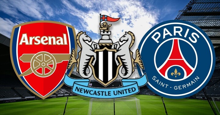
According to The Chronicle, Newcastle United officially unveiled its new club crest on Thursday morning local time. After a 791-day consultation process involving fans and industry experts, the club opted to refine the existing crest rather than completely redesign it. Newcastle hopes the new visual system will enhance the club's brand marketing capabilities, bringing it in line with clubs like Arsenal and Paris Saint-Germain.
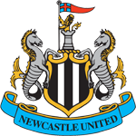
Newcastle's new crest does not significantly alter the design used since 1988 but rather adjusts existing elements to make the overall shape more concise, clear, and unified.
The club believes the old crest had too many details and inconsistencies, with thousands of different versions existing within St. James' Park alone. This created difficulties for merchandise production and high-quality presentation on digital platforms. Therefore, one of the key goals of the new crest was to establish a unified visual standard.
During the design process, Newcastle consulted with 19,500 club members and season ticket holders. Surveys showed that 84% of respondents wanted the existing crest to be refined rather than completely redesigned, and the vast majority opposed changing the crest to a circular shape.
Consequently, the club never seriously considered a radical overhaul of the crest. Prior to the unveiling, insiders cited Juventus' change from its traditional crest to a "J" logo as an example. Newcastle ultimately chose to follow fan opinion and retain the core structure of the original crest.
The new crest continues to feature traditional elements such as seahorses, the black and white shield, the lion, flags, and the castle. The design was led by Kenneth McKeefe, the club's Chief Creative Officer, who is a long-time Newcastle United fan and typically attends matches in the Leazes Stand at St. James' Park.
McKeefe previously served as Nike Football's Global Design Director and was involved in kit designs for England, Barcelona, and Paris Saint-Germain.
Fan surveys also revealed that among the various elements of the old crest, the castle was the most valued, with 55% of respondents considering it the most important element. Therefore, in Newcastle's new brand visual system, the castle has been established as an important secondary emblem and visual symbol.
Steven Taylor, the club's Chief Marketing Officer, believes this system provides more possibilities for Newcastle's brand communication. Opting for a simpler crest design would have made it difficult to tell many brand stories centered on the club's history and city culture.
Specifically, the seahorses on the crest symbolize Newcastle's industrial and maritime heritage, the castle has been a significant symbol of the city for centuries, and the shield has a historical connection to the Newcastle team that won the Inter-Cities Fairs Cup in 1969.
Newcastle believes that retaining these elements not only maintains the regional identity of its local core fans but also helps introduce the culture and history represented by the club to new fans globally.
Taylor believes that the new design, led by McKeefe and his team, will bring Newcastle into the same conversation as Arsenal, Paris Saint-Germain, and other clubs regarded as industry leaders in brand marketing.
This is also part of the long-term plan of Newcastle's Chief Executive Officer, David Hopkinson, who aims for both the Newcastle men's and women's teams to consistently compete for the Premier League and Women's Super League titles by 2030.
The Chronicle notes that whether this goal will ultimately be achieved remains to be seen, but the new brand system is another step Hopkinson is taking to accelerate the club's development through controllable methods, with one objective being to gradually narrow the income gap between Newcastle and the traditional "Big Six" Premier League clubs.
AF's PC site is now live! Browse full news, comments, match details and stats on your computer. Visit: www.allfootballapp.com
 Newcastle United
Todos los comentarios